Acacia Identity
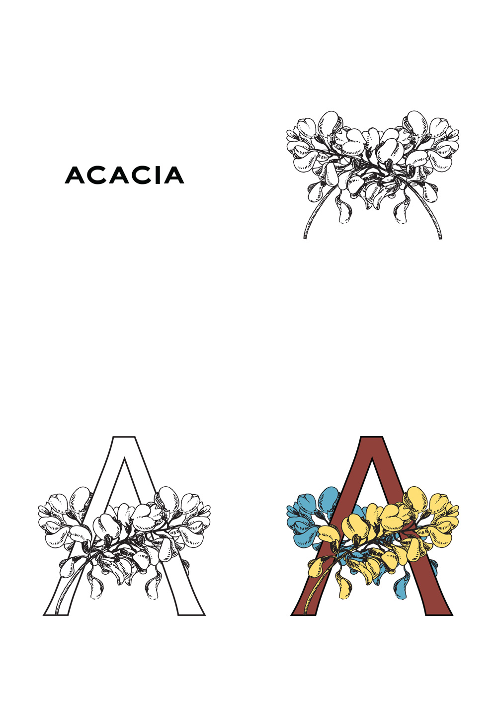
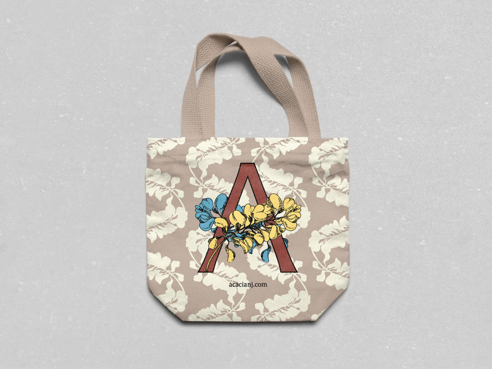
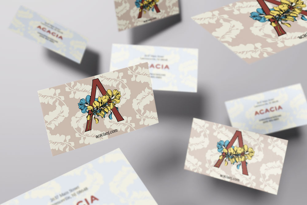
"Acacia" has a lot going for it. From the root to the fruit, the acacia tree is full of interesting and exciting forms; the word "acacia" iself is a sequence of repeating vowels and consonents, with an 'i' thrown in for good measure. Too often, this potential gets ignored in favor of an obvious solution of combining a tree silhouette with some typography. The world needs more trees, yes, but the world of graphic design does not need more tree silhouette logomarks.
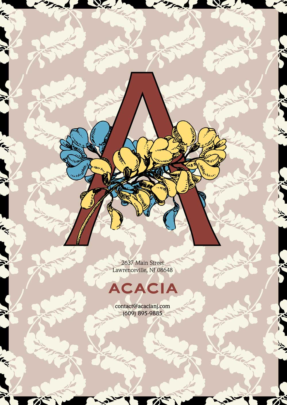
The mark borrows elements from the tree to complete the letterform. The overall form suggests classical florated majescules without overly committing to ceremonious formality. The associated "ACACIA" lettering is drawn with inspiration from typography found on early 20th century flora illustration plates.
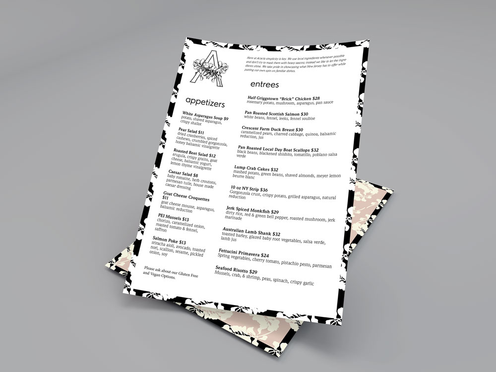
The menu and branding use ITC Weidemann, a typeface designed by Kurt Weidemann in 1983. Originally named Biblica, the face was designed for use in bibles. As a result, it allows for many characters to fit onto a single line without compromising legibility or elegance.