Figure A Media Identity
Putting the pieces together.
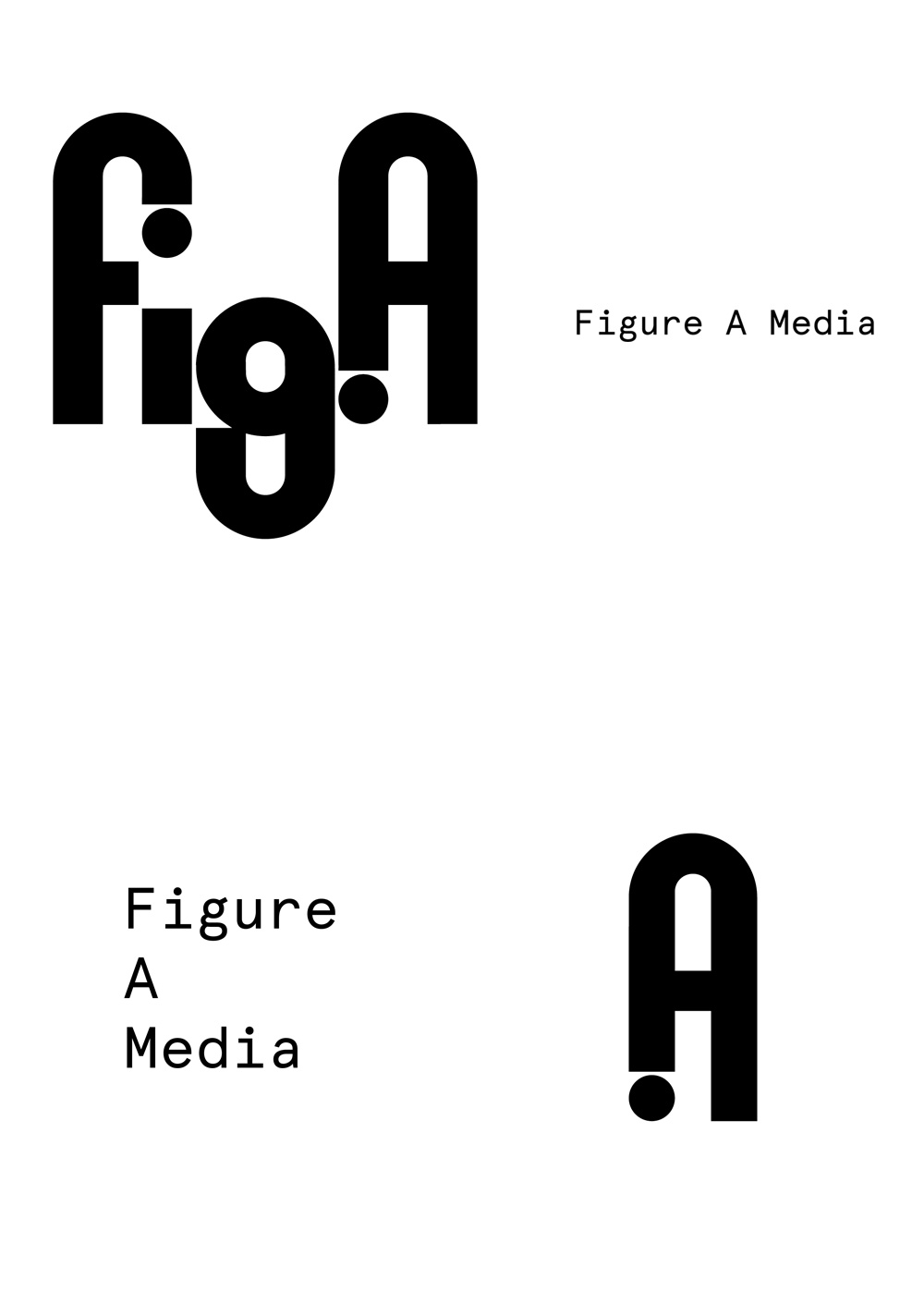
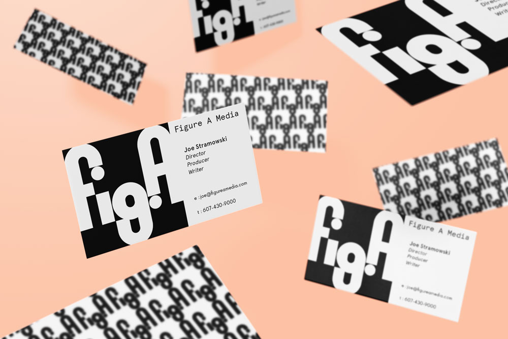
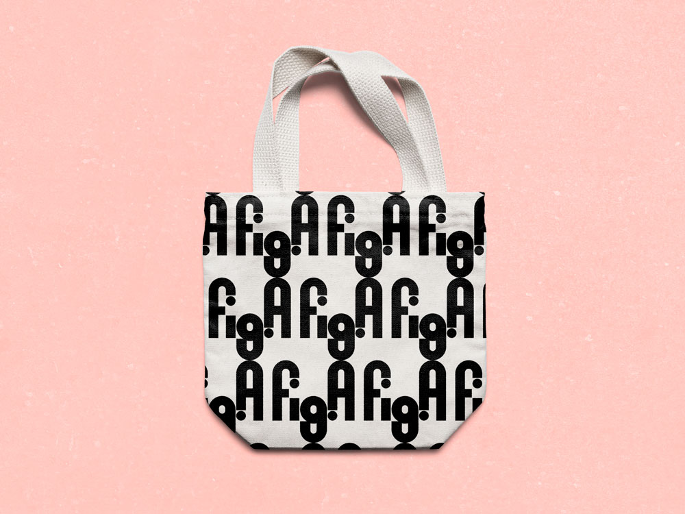
A media company that prides itself on its documentary credentials — on following narrative routes and making connections. Similarly, the logotype collects similar forms and counterforms to create a visual circuit for the eye to follow and interpret. The static logotype becomes remarkably dynamic when arranged into a pattern, with criss-crossing dots and g's keeping the eye busy.
The identity uses Apercu Mono, a typeface created in 2009 by Colophon Foundry. Apercu was conceived as a blend of classic realist typefaces, like Gill Sans and Franklin Gothic. The result is a hip yet structured face, with its light weight providing a needed foil for the heavy strokes found in the logotype.
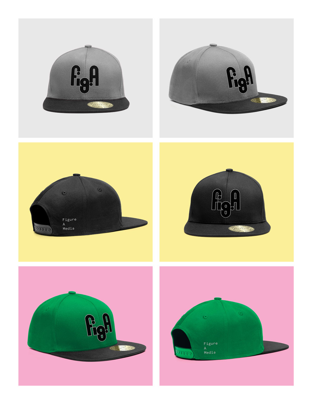
And hats. Who doesn't like hats?