Garguilo Brothers Identity
Brewing beer is as scientific as it is alchemical. How can a brewing company's identity similarly blend geometric perfection with organic charm?
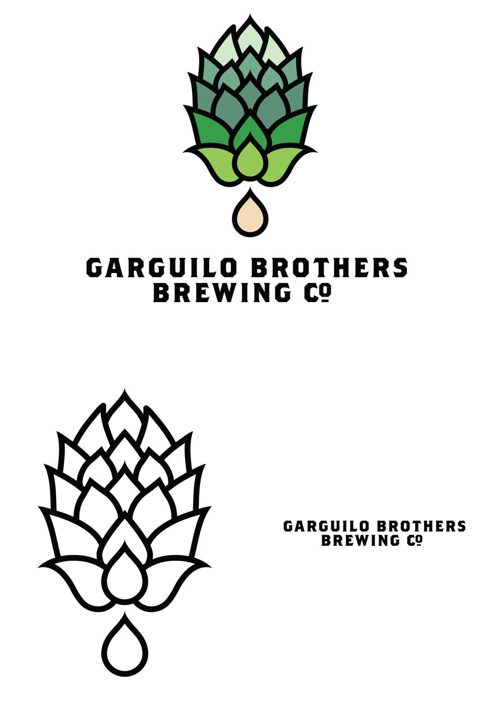
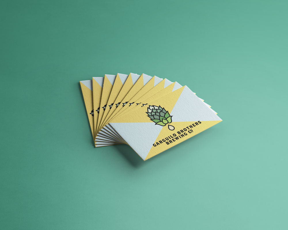
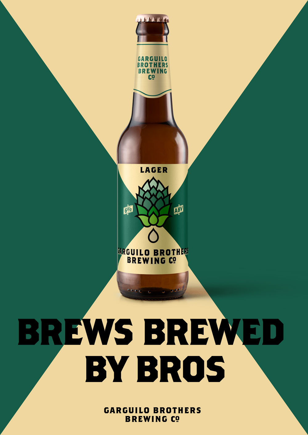
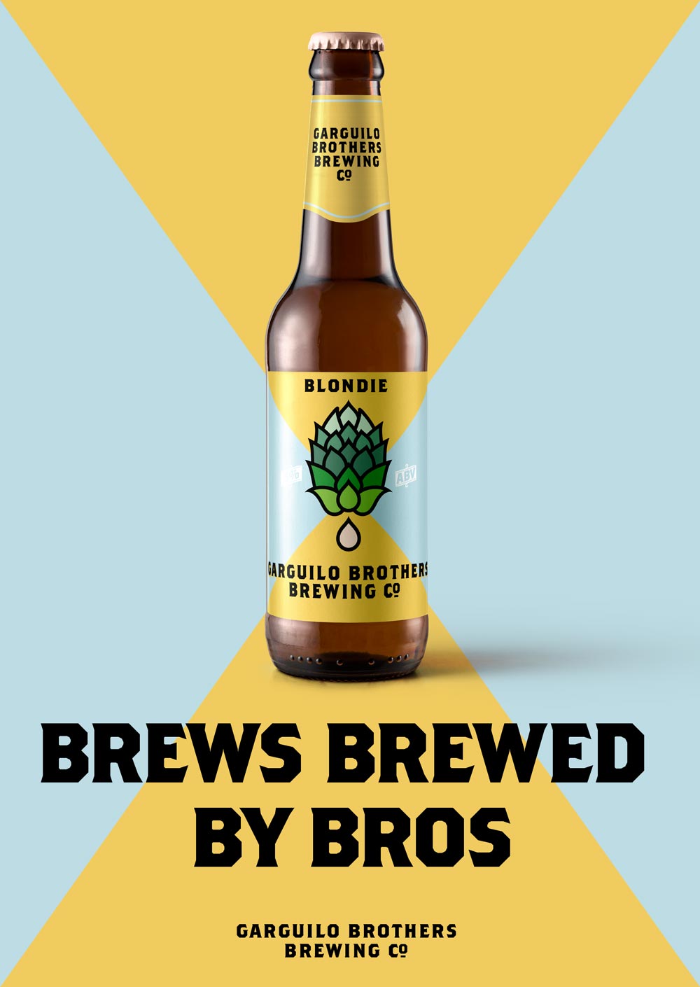
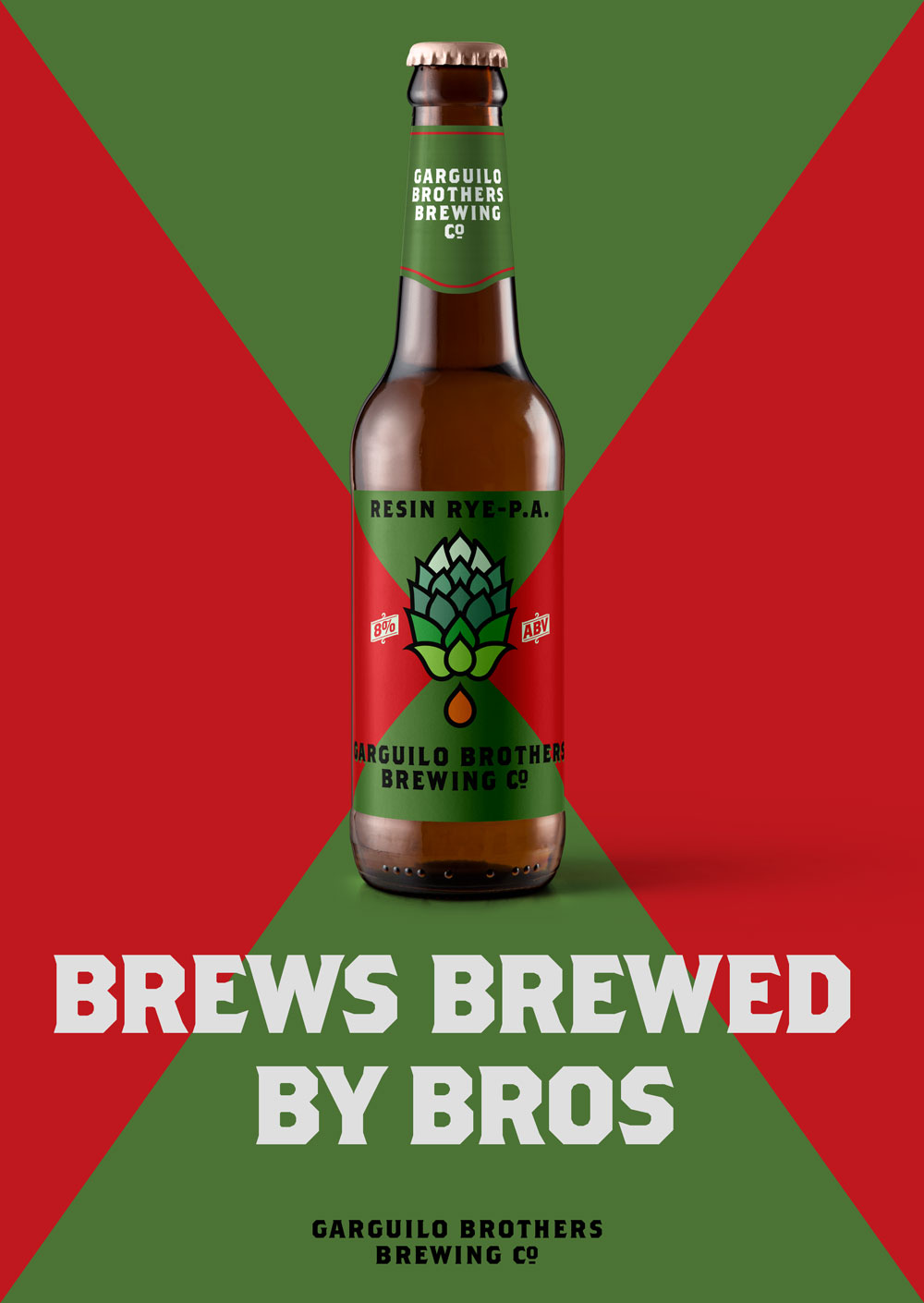
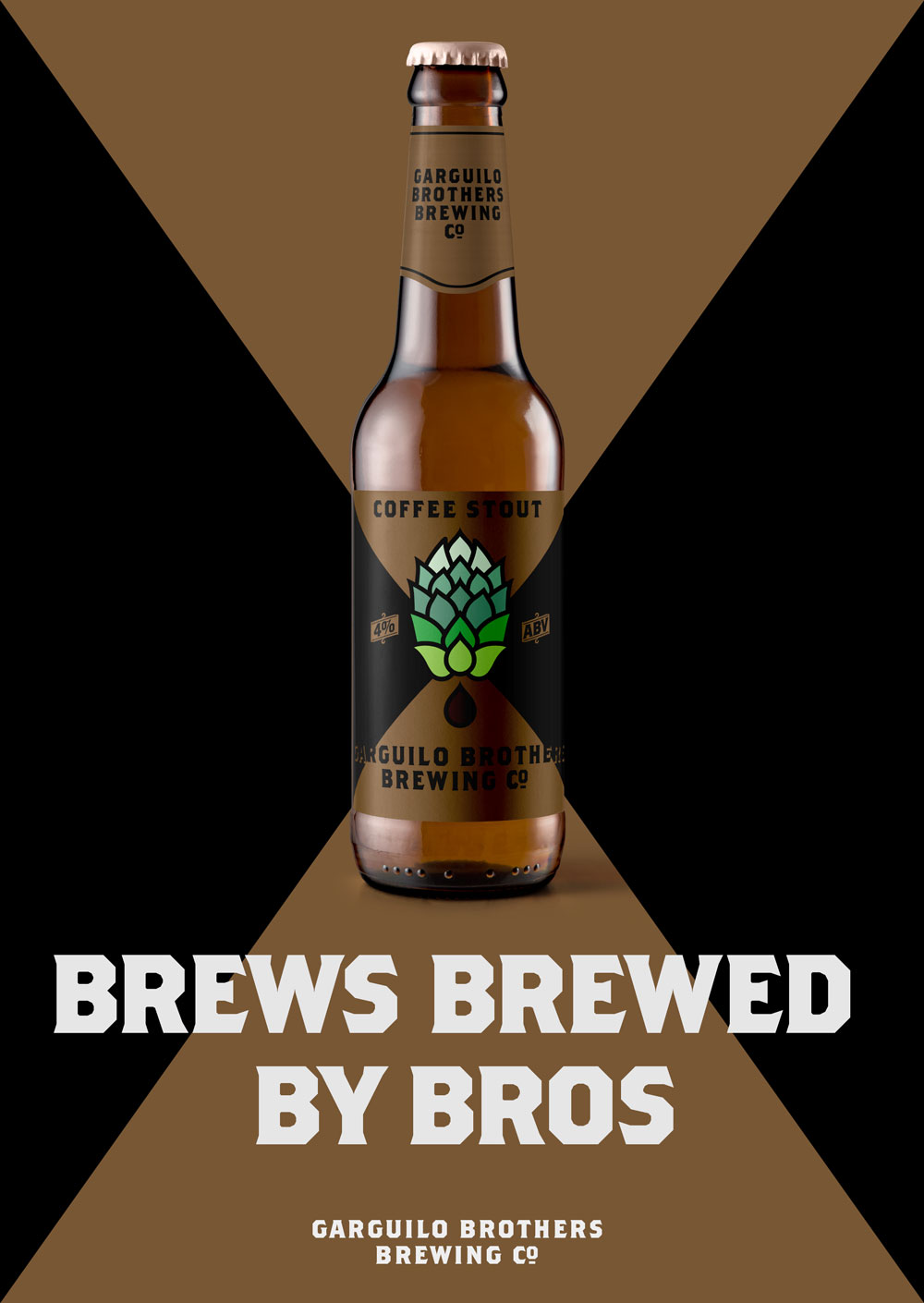
The mark is a hop, one of the fundamental beer-gredients. In this case, the flower's organic form is recast as a collection of geometric shapes. A droplet falling from the hop implies the brewing process, with its final liquid product, beer. The droplet can be colored to match each beer's unique hue.
The identity uses Brothers, a typeface designed by John Downer in 1999. Full of sharp corners and acute angles, the face was inspired by turn of the century American traveling circus lettering. The letterforms were originally drawn and cut-in on a lithography stone, which gives their intense geometry an undeniably organic feel.